 Colorplan
Benjamin Moore Antique Parchment (959) is a mid-tone beige with a warm yellow undertone and an LRV of 60. Closest matches: Sherwin-Williams Softer Tan (SW 6141), Farrow & Ball Savage Ground (No.213) and Behr Toasted Cashew (PWN-66). For trim, try Sand Dollar (OC-71).
Room Preview
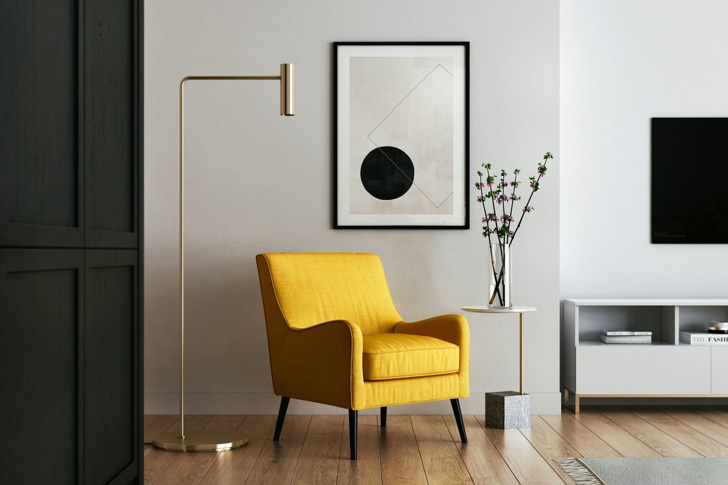
This photo shows walls only. Photos show the color in a real room's light; your own light will change it.
Suggested trim and ceiling are Benjamin Moore whites that share this color's undertone.
Color Details
| Family | Beige |
| LRV | 59.6 (mid-tone; 0 = black, 100 = pure white) |
| HEX | #DAC9AB |
| RGB | 218, 201, 171 |
| HSL | 38°, 39%, 76% |
About Antique Parchment
Antique Parchment (959) is a mid-tone beige from Benjamin Moore with a warm yellow undertone. With an LRV of 60, Antique Parchment has visible color without darkening a room much.
In north-facing rooms the cool daylight tones down Antique Parchment's warmth, so it can read a little grayer; south- and west-facing light brings the warmth forward. It's a good fit for open-plan living areas, hallways, living rooms and bedrooms. It's very close to Putnam Ivory (HC-39); you'd mostly see the difference side by side.
How Antique Parchment changes with the light
Antique Parchment has a strong warm undertone that balances cool north light well. In strong south or west sun it can look more golden, so check a sample at midday and in the late afternoon.
North-facing rooms
Antique Parchment's warmth balances the cool north light, which is why warmer colors are the safe pick for north rooms.
East-facing rooms
Antique Parchment will look warmer and brighter in the morning and cooler and grayer by afternoon; check a sample at both times.
South-facing rooms
In strong south light Antique Parchment can turn noticeably more yellow or orange; test a sample at midday.
West-facing rooms
Antique Parchment will glow warmer in the late afternoon, so check it at sunset if you want to avoid a strong yellow cast.
See Antique Parchment in real homes
Photos people have shared of Antique Parchment in their own rooms. Opens Instagram or Pinterest in a new tab.
Antique Parchment equivalents in other brands
The closest color from each brand. ΔE (“delta E”) scores how different two colors look: under 2.5 is very hard to tell apart on a wall, over 5 is clearly different.
Sherwin-Williams
Very close · ΔE 2.1
Also close: Ivoire (ΔE 2.4)
Compare side by side →Farrow & Ball
Very close · ΔE 1.2
Also close: String (ΔE 1.7)
Compare side by side →Similar Benjamin Moore colors
Antique Parchment questions
What undertone does Antique Parchment have?
Antique Parchment has a warm yellow undertone, so it reads as a warm color. In north-facing rooms the cool daylight tones down Antique Parchment's warmth, so it can read a little grayer; south- and west-facing light brings the warmth forward.
Is Antique Parchment a light or dark color?
Antique Parchment has a light reflectance value (LRV) of 59.6 on a scale where 0 is black and 100 is pure white, which makes it a mid-tone color. With an LRV of 60, Antique Parchment has visible color without darkening a room much.
What is the closest match to Antique Parchment in other paint brands?
Sherwin-Williams: Softer Tan SW 6141 (very close, ΔE 2.1); Farrow & Ball: Savage Ground No.213 (very close, ΔE 1.2); Behr: Toasted Cashew PWN-66 (close, ΔE 3.1). Matches are calculated with the CIEDE2000 color difference formula; always check a physical sample before buying.
What trim and ceiling color goes with Antique Parchment?
Try Sand Dollar (OC-71) on trim and Opulence (OC-69) on the ceiling. Both are Benjamin Moore whites that share Antique Parchment's undertone.
Where does Antique Parchment work best?
Antique Parchment works well in open-plan living areas, hallways, living rooms and bedrooms. With an LRV of 60, Antique Parchment has visible color without darkening a room much.
Planning more than one room?
Build a whole-house palette and share it with your contractor. Free.