 Colorplan
Benjamin Moore Brilliant Amber (161) is a mid-tone orange with a warm peach undertone and an LRV of 40. Closest matches: Sherwin-Williams Gold Crest (SW 6670). For trim, try Peach Parfait (2175-70).
Room Preview
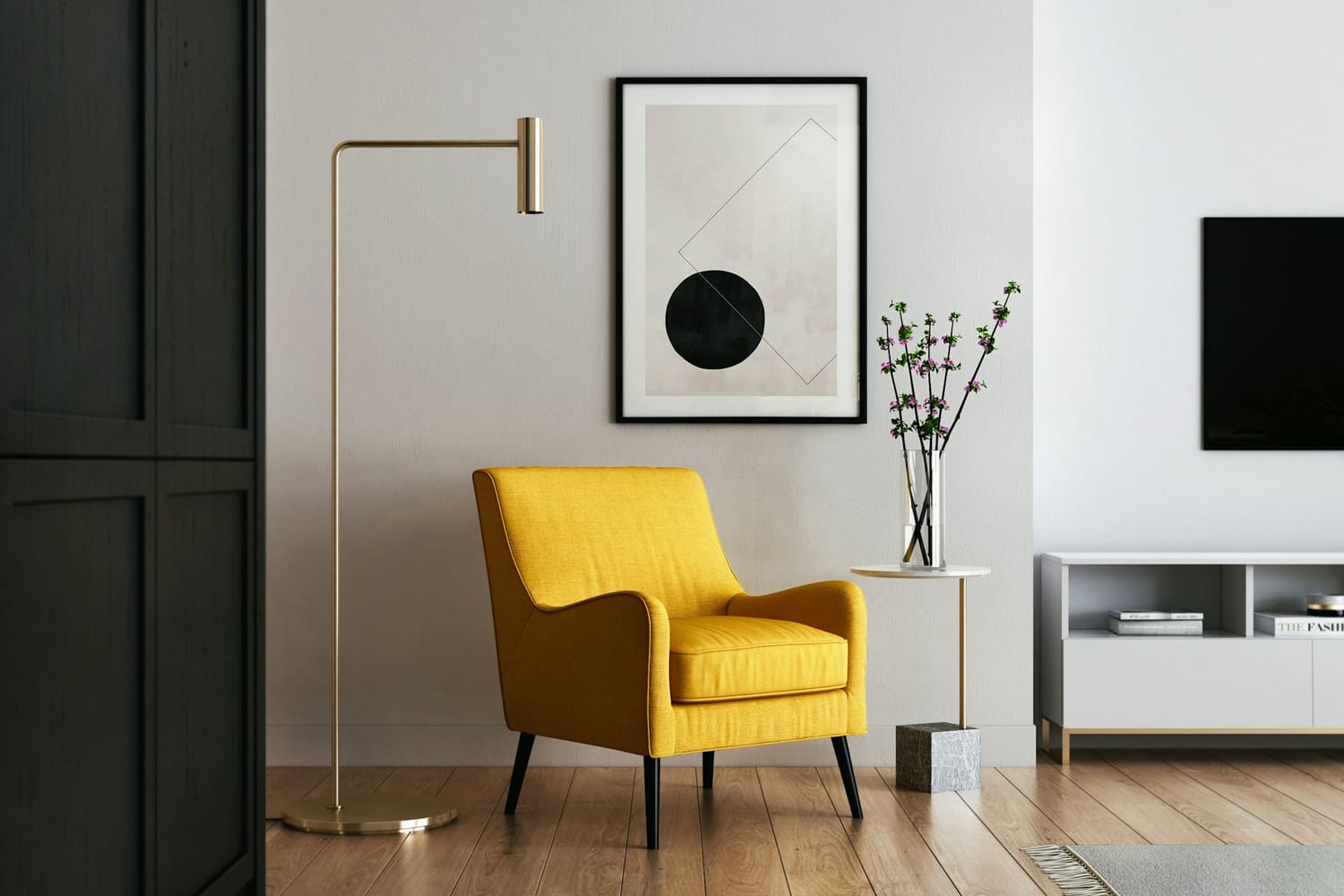
This photo shows walls only. Photos show the color in a real room's light; your own light will change it.
Suggested trim and ceiling are Benjamin Moore whites that share this color's undertone.
Color Details
| Family | Orange |
| LRV | 40.0 (mid-tone; 0 = black, 100 = pure white) |
| HEX | #E39A50 |
| RGB | 227, 154, 80 |
| HSL | 30°, 72%, 60% |
About Brilliant Amber
Brilliant Amber (161) is a mid-tone, bold orange from Benjamin Moore that leans peach. With an LRV of 40, Brilliant Amber has visible color without darkening a room much.
In north-facing rooms the cool daylight tones down Brilliant Amber's warmth, so it can read a little grayer; south- and west-facing light brings the warmth forward. It's a good fit for living rooms, bedrooms and accent walls. Next to Antelope Canyon (125), it's darker and warmer.
How Brilliant Amber changes with the light
Brilliant Amber has a strong warm undertone that balances cool north light well. In strong south or west sun it can look more golden, so check a sample at midday and in the late afternoon.
North-facing rooms
Brilliant Amber's warmth balances the cool north light, which is why warmer colors are the safe pick for north rooms.
East-facing rooms
Brilliant Amber will look warmer and brighter in the morning and cooler and grayer by afternoon; check a sample at both times.
South-facing rooms
In strong south light Brilliant Amber can turn noticeably more yellow or orange; test a sample at midday.
West-facing rooms
Brilliant Amber will glow warmer in the late afternoon, so check it at sunset if you want to avoid a strong yellow cast.
See Brilliant Amber in real homes
Photos people have shared of Brilliant Amber in their own rooms. Opens Instagram or Pinterest in a new tab.
Brilliant Amber equivalents in other brands
The closest color from each brand. ΔE (“delta E”) scores how different two colors look: under 2.5 is very hard to tell apart on a wall, over 5 is clearly different.
Sherwin-Williams
Close · ΔE 4.4
Also close: Persimmon (ΔE 11.8)
Compare side by side →Farrow & Ball
Closest available · ΔE 7.4
Also close: India Yellow (ΔE 8.1)
Compare side by side →Behr
Closest available · ΔE 12.4
Also close: Honey Tea (ΔE 14.2)
Compare side by side →Similar Benjamin Moore colors
Brilliant Amber questions
What undertone does Brilliant Amber have?
Brilliant Amber has a warm peach undertone, so it reads as a warm color. In north-facing rooms the cool daylight tones down Brilliant Amber's warmth, so it can read a little grayer; south- and west-facing light brings the warmth forward.
Is Brilliant Amber a light or dark color?
Brilliant Amber has a light reflectance value (LRV) of 40.0 on a scale where 0 is black and 100 is pure white, which makes it a mid-tone color. With an LRV of 40, Brilliant Amber has visible color without darkening a room much.
What is the closest match to Brilliant Amber in other paint brands?
Sherwin-Williams: Gold Crest SW 6670 (close, ΔE 4.4); Farrow & Ball: Orangery No.70 (closest available, ΔE 7.4); Behr: Canyon Dusk S210-4 (closest available, ΔE 12.4). Matches are calculated with the CIEDE2000 color difference formula; always check a physical sample before buying.
What trim and ceiling color goes with Brilliant Amber?
Try Peach Parfait (2175-70) on trim and Whitewater Bay (OC-70) on the ceiling. Both are Benjamin Moore whites that share Brilliant Amber's undertone.
Where does Brilliant Amber work best?
Brilliant Amber works well in living rooms, bedrooms and accent walls. With an LRV of 40, Brilliant Amber has visible color without darkening a room much.
Planning more than one room?
Build a whole-house palette and share it with your contractor. Free.