 Colorplan
Sherwin-Williams Porcelain (SW 0053) is a light warm white with a warm yellow undertone and an LRV of 75. Closest matches: Benjamin Moore Peau de Soie (AF-60), Farrow & Ball Dimity (No.2008) and Behr Tuscan Beige (PWN-62). For trim, try Snowbound (SW 7004).
Compare with: Shoji White · Aesthetic White · Divine White
Room Preview
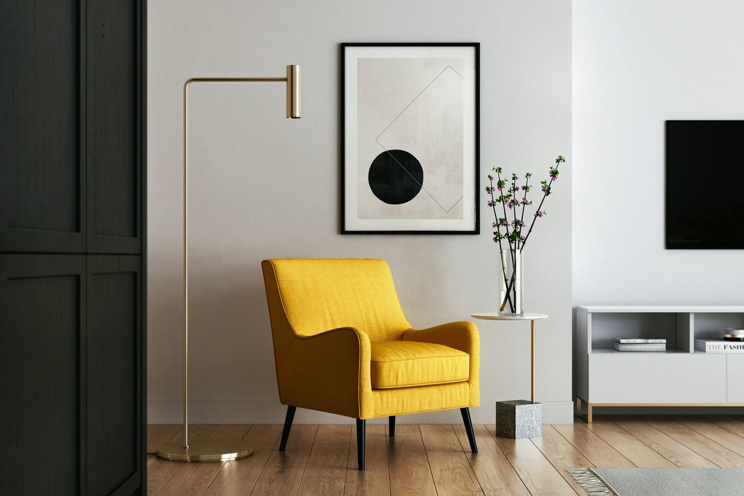
This photo shows walls only. Photos show the color in a real room's light; your own light will change it.
Suggested trim and ceiling are Sherwin-Williams whites that share this color's undertone.
Color Details
| Family | White |
| LRV | 75.4 (light; 0 = black, 100 = pure white) |
| HEX | #E9E0D5 |
| RGB | 233, 224, 213 |
| HSL | 33°, 31%, 87% |
About Porcelain
Porcelain (SW 0053) is a light warm white from Sherwin-Williams with a warm yellow undertone. With an LRV of 75, Porcelain reflects most of the light that hits it, which helps small or dim rooms feel larger.
In north-facing rooms the cool daylight tones down Porcelain's warmth, so it can read a little grayer; south- and west-facing light brings the warmth forward. It's a good fit for whole-house walls, living rooms, bedrooms and trim with a deeper wall color. It's very close to Shoji White (SW 7042); you'd mostly see the difference side by side.
History of Porcelain
Part of Sherwin-Williams' Historic Paint Colors, in its The Classics (1800s–1860s) palette.
“Dominated by the era’s grays and neutrals, this collection includes colors from the earliest days of a young American republic.”
Source: Historic Paint Colors: The Classics, Sherwin-Williams
How Porcelain changes with the light
Porcelain has a fairly balanced undertone: it shifts a little cooler in north light and a little warmer in afternoon west light, which makes it an easy choice for most rooms.
North-facing rooms
In north light Porcelain will look a little cooler and grayer than on the chip.
East-facing rooms
Porcelain will look warmer and brighter in the morning and cooler and grayer by afternoon; check a sample at both times.
South-facing rooms
Bright south light shows Porcelain close to its true color, slightly lighter and warmer.
West-facing rooms
Porcelain will glow warmer in the late afternoon.
See Porcelain in real homes
Photos people have shared of Porcelain in their own rooms. Opens Instagram or Pinterest in a new tab.
Colors that go with Porcelain
Sherwin-Williams colors to use alongside it, picked by color math: the same hue lighter and deeper, a white for trim, and an accent from the opposite side of the color wheel. These are our suggestions, not a Sherwin-Williams palette; look at samples together before you buy.
Darker, same family
Keystone Gray SW 7504The same hue, deeper (LRV 29): for doors, cabinets or a feature wall.
Accent
Bunglehouse Blue SW 0048From the opposite side of the color wheel (LRV 11): for a door, a piece of furniture or one wall.
Porcelain equivalents in other brands
The closest color from each brand. ΔE (“delta E”) scores how different two colors look: under 2.5 is very hard to tell apart on a wall, over 5 is clearly different.
Benjamin Moore
Very close · ΔE 1.4
Also close: Cocoa Butter (ΔE 1.4)
Compare side by side →Farrow & Ball
Very close · ΔE 1.4
Also close: Slipper Satin (ΔE 2.4)
Compare side by side →Similar Sherwin-Williams colors
Porcelain questions
What undertone does Porcelain have?
Porcelain has a warm yellow undertone, so it reads as a warm color. In north-facing rooms the cool daylight tones down Porcelain's warmth, so it can read a little grayer; south- and west-facing light brings the warmth forward.
Is Porcelain a light or dark color?
Porcelain has a light reflectance value (LRV) of 75.4 on a scale where 0 is black and 100 is pure white, which makes it a light color. With an LRV of 75, Porcelain reflects most of the light that hits it, which helps small or dim rooms feel larger.
What is the closest match to Porcelain in other paint brands?
Benjamin Moore: Peau de Soie AF-60 (very close, ΔE 1.4); Farrow & Ball: Dimity No.2008 (very close, ΔE 1.4); Behr: Tuscan Beige PWN-62 (very close, ΔE 1.3). Matches are calculated with the CIEDE2000 color difference formula; always check a physical sample before buying.
What trim and ceiling color goes with Porcelain?
Try Snowbound (SW 7004) on trim and High Reflective White (SW 7757) on the ceiling. Both are Sherwin-Williams whites that share Porcelain's undertone.
Where does Porcelain work best?
Porcelain works well in whole-house walls, living rooms, bedrooms and trim with a deeper wall color. With an LRV of 75, Porcelain reflects most of the light that hits it, which helps small or dim rooms feel larger.
What colors go with Porcelain?
From Sherwin-Williams, by color math: Snowbound (SW 7004) for trim and ceilings, Keystone Gray (SW 7504) as a deeper color of the same hue, Bunglehouse Blue (SW 0048) as an accent. Compare samples together before you buy.
Planning to paint a room or a whole house?
Pick walls, trim and ceiling for one room or every room, then share the plan with your contractor. Free.